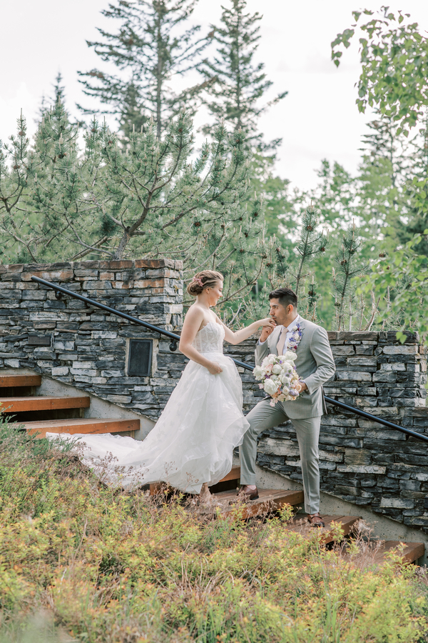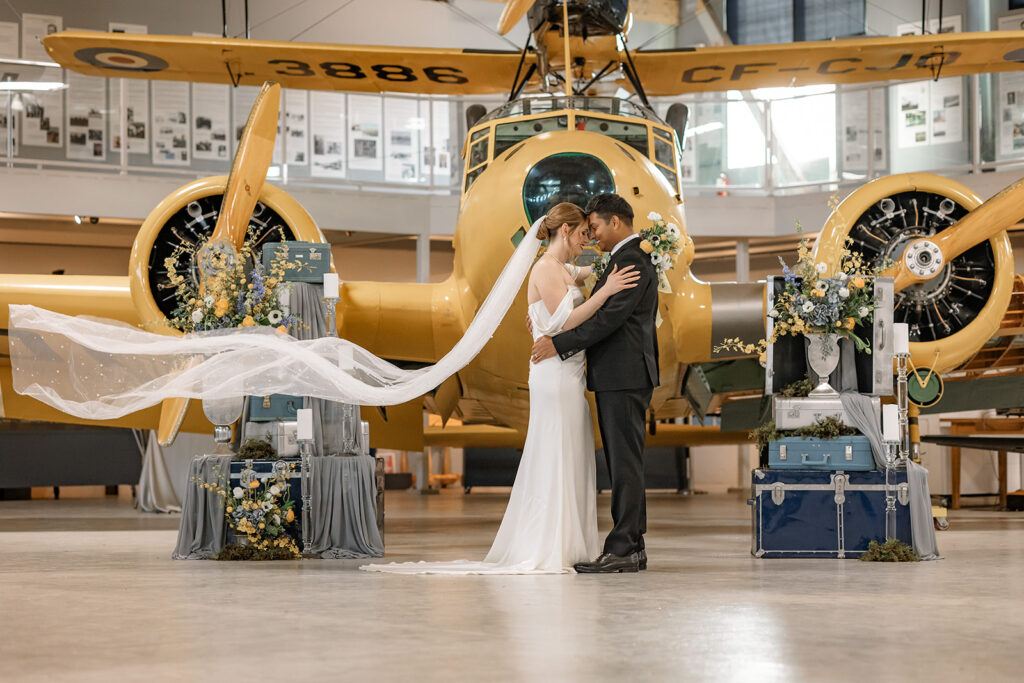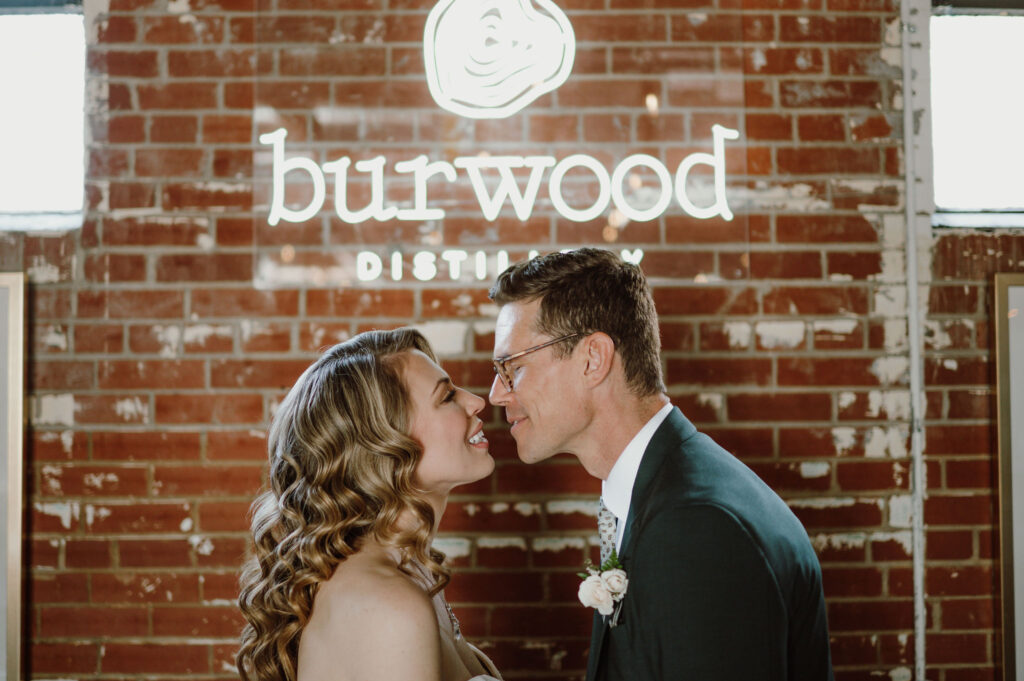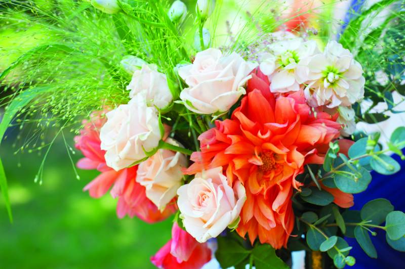
Colour breathes life into every wedding design. Choosing the perfect palette for your wedding is a key decision that affects not only the style but the personality and aesthetics of the environment as well. Confidence is vital when creating effective colour combinations. Used correctly, colour can bring a vision to life. Used incorrectly, it can destroy even the most expensive design. Some brides are design savvy and are able to use colours with ease, while others may feel more comfortable seeking the advice of wedding professionals who have years of experience.
There are several different colour schemes to choose from when designing your wedding palette, depending on how many colours you wish to incorporate. One feature colour with an accent is a classic choice that is relatively easy to pull off. If you would like to incorporate more than one feature colour however, we recommend that you begin by referencing a colour wheel. Choose one feature colour first, and then select a colour scheme such as analogous, complimentary, or monochromatic. Your colour scheme is a formula for selecting all other colours, the rest will just fall into place!
Marigold, Lemon & Pumpkin
Warm Shades like yellow and orange are associated with sunshine and roaring fires. These colors and undertones will contribute towards a cheerful, welcoming space. Because of their brightness warm shades appear to spring forward, making a room feel more intimate. The luminous quality of warm colors is also energizing and is known to stimulate conversation and appetites. To bring the temperature down a notch, try mixing in cool blue, grey or green accents.
Blueberry, Aqua & Periwinkle
Cool hues are outgoing, confident and creative. Used in abundance they create a receding effect, making a space seem larger. Color experts say that cool blues also encourage calmness and focus. If you are looking for a crisp, clean vibe, a splash of cool blue may be the answer. To prevent watery shades from feeling too cold, we suggest balancing them with accents of yellow, orange, or brown.
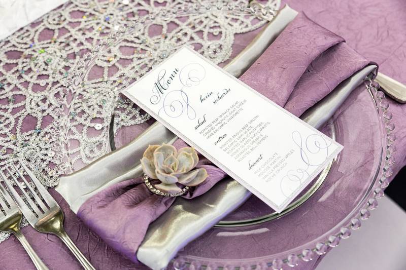
Emerald, Ruby, Sapphire & Amethyst
Rich jewel tones lend instant glamour to any space. The brilliant, concentrated colors can make a room without much architectural interest feel intense and luxurious. Depending on how they are used, they can also create intimacy in an imposing space, or make a small room feel cozy. Jewel tones have a dynamic, enveloping effect because of the brightness of the colors. To keep things from becoming overbearing, try pairing jewel tones with neutrals of the same intensity.
Finding the perfect wedding colours:
- Be inspired by your venue’s colour scheme. Look to your venue for existing colour schemes, and consider if this will be something you can work with or will need to disguise.
- Know what your priorities are. If you have family heirlooms to work into your décor you will want to communicate this early on to your wedding planner. This way you will ensure that your grandmother’s ivory table runner doesn’t get lost in the décor, and stands out like you want it to.
- Set The Mood. Your Wedding colours can set the vibe for your entire day! Consider what mood or atmosphere you are trying to create when choosing your wedding colours.
- Do your research. Magazines, scrapbook stores, Pinterest and even paint shops are great sources of inspiration for colour combinations. Look towards art and industrial design to see colours in a new way.
- Consult a Colour Wheel. You don’t need an art degree to pick your wedding palette, but there are a few basic principles you should know to avoid a colour catastrophe. Your goal? Colour harmony.
Achieving Color Harmony
We have all heard someone say “those colors clash” or “don’t work together,” but do we know why? To create a harmonious colour palette, one must understand color relationships and how to develop a finished palette that is pleasing to the eye. Successful color schemes rely on a knowledge of hue, value and chroma. When something is not harmonious, it’s either boring or chaotic.
Wedding planners and other designers have years of experience working with colour harmony and psychology, and can come up with several colour palettes with ease and confidence.
Sources
F8 Photography/Amborella/The Social Page Design Studio/The Wedding Fair Calgary/Epic Events and Weddings/Chair Flair


